Tutorial 2 - Understanding fMRI Statistics and Statistical Maps
Goals
To understand how statistics can be employed on a voxelwise basis to analyze fMRI data
To understand how data can be split into explained (signal) and unexplained (noise) variance
To understand how we can determine if activation is statistically significant
To understand how to interpret simple statistical maps
Accompanying Data
Background and Overview
This lecture assumes that you have an understanding of basic statistics. If you have taken a stats course in Psychology and worked with behavioral data, many of the statistical tests that can be employed for fMRI will be familiar to you — correlations, t tests, analyses of variance (ANOVAs) and so forth. These tests can be applied to fMRI data as well, using similar logic. This tutorial will introduce t-tests as a way of testing whether activation to a stimulus is significantly greater than baseline.
Understanding fMRI statistics for data over time
For fMRI data, there are two levels at which we can look at variance: variability over time and variability over participants.
In this tutorial, we will examine the first case -- how statistics can be used to estimate the amount of activation within data from a single participant. In later tutorials, we will learn how to employ the second approach, in which we can combine data between participants and look at the consistency of effects across individuals.
Time Series: Data, Signal, and Noise
Let's begin by looking at how we can statistically analyze data that changes over time. The time course shown below depicts the change of something over time. This could be any kind of time series, such as brain activation over time or daily temperature over a two-year period. This change over time is what we call the temporal variance.
We can try to explain some of this variability over time with a model (i.e., predictors), here a sinusoidal model. The variance that can be accounted for (or explained) by the model is the signal. However, the model can not explain all of the data. The error or noise (the part of the variance we cannot explain) can be seen in the residuals, which are computed by subtracting the model from the data.
These three parts are depicted in Figure 1 below.
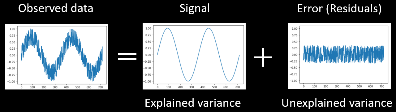
Figure 2-1. Any data (such as a time series) can be decomposed into explained and unexplained variance.
Usually, we do not know what is the amount of true signal because our data is a combination of both signal and noise. The best we can do is estimate the amount of signal we think is in the data.
To do this, we must fit our model to the data. Once we have obtained an estimate of the signal, we can conduct statistical tests to know, for example, whether this estimate is significantly different zero.
Fitting a model to a time series
Let's examine an example of how we can fit a model to a time series.
Activity #1

Widget 1. A predictor function can be scaled by a beta weight to fit simulated data for two voxels.
Open Widget 1 in a new window by clicking on the plot. (Note: if you have trouble opening the animation, please see our troubleshooting page).
Widget 1 shows a simulated 'data' time course in grey and a single predictor (model) in purple using arbitrary units (y axis) over time in seconds (x axis). The predictor can be multiplied by a beta weight (scaling factor), and a constant can be added using the sliders. Below the data time course is the residual time course, which we obtain by subtracting the model -- that is the scaled predictor -- from our data at each point in time (i.e., data - predictor = residuals).
Adjust the sliders for Voxel 1 so that the purple line (predictor) overlaps the black line (signal). Then click on the "Optimize GLM" button to get the optimal solution.
Question 1:
a) How can you tell when you've chosen the best possible beta weight and constant? Consider:
- the similarity of the predictor (purple) and the data (black) in the top panel
- the appearance of the residual plot in the bottom panel
- the sum of squared residuals (SSR)
b) What is the value of the optimal beta weight and constant?
Concretely, the beta weight allows us to quantify the amount of activation in our time course. However, we might also want quantify how much variance is explained by the model.
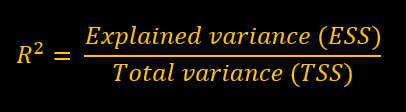
Equation 2-1. Equation to find the proportion of explained variance. Note that we can multiply the proportion of explained variance by 100 to obtain the percentage of explained variance.
Recall that data can be split into to two parts: explained variance and unexplained (i.e., residual) variance. We can quantify the amount of unexplained variance by calculating the residual sum of squares(RSS; how much the data deviates from the predictor) and the amount of total variance by calculating the total sum of squares (TSS; how much the data deviates overall) . Then, we simply subtract the total from unexplained variance to get the explained variance (ESS = TSS-RSS) . To obtain R 2 (i.e., the proportion of explained variance ) , we can simply divide the amount of exaplained variance by the total variance.
Question 2:
a) What percentage of the total variance does the current model (purple predictor) explain for Voxel 1?
b) What percentage of the total variance would a perfect model account for?
In practice, we don't expect to find a perfect fit between predictors and data. Voxel 2 is a more realistic example of noisy data. Select
Voxel 2
and
adjust the sliders
until you find the beta weight and constant that best fit the data.
Question 3: What is the R2 for voxel 2? Why is it lower than the R2 for Voxel 1?
Another way of thinking about proportion of explained variance is in terms
signal-to-noise ratio
. A high signal to noise ratio(lots of signal with little noise) will have greater percent of explained variance, while a lower signal to noise ratio (little signal with lots of noise) will result in a smaller percent of explained variance.
Question 4: Which out of voxel 1 and 2 has the greatest signal-to-noise ratio?
Fitting a single predictor to real fMRI data
Let's now look at some real time courses by considering the simplest possible example: one run from one participant with two conditions. Note that we always need at least two conditions so that we can examine differences between conditions using subtraction logic. This is because measures of the BOLD signal in a single condition are affected not only by neural activation levels but also by extraneous physical factors (e.g., the coil sensitivity profile) and biological factors (e.g., the vascularization of an area). As such, we always need to compare conditions to look at neural activation (indirectly) while subtracting out other factors.
In this case, we will look at the first localizer run. Recall that this run is composed of four visual conditions (faces, hands, bodies and scrambled) and 1 baseline condition. For now, we will group the four visual conditions into one visual condition, leaving us with only two conditions (visual stimulation vs baseline).
Activity #2
Open Widget 2 in a new window and adjust the sliders to fit the visual predictor (in pink) to Voxel A's time course as closely as possible. Then click on the "Optimize GLM" button to get the optimal solution.
Question 5:
a) What is the optimal beta weight and constant for Voxel A?
b) What percent of the variance is explained by the visual predictor?
Now fit the visual predictor to the data in voxels B, C and D.
Question 6:
a) How much percentage of the variance does the model explain in voxels B, C and D?
b) What is the most obvious factor that hinders the fit of the model for Voxel B?
c) Voxels E and F have interpretable time courses but the R2 are not very high. Why?

Widget 2. A model with one predictor (visual stimulation vs. baseline) can be used to fit different voxels from one run of one participant for the course localizer data.
Is the activation significant compared to baseline?
Now that we have learned how to fit a model to the data, we might want to determine whether the activation for the activation for the visual condition (as measured by the beta weight) is statistically different from baseline.
Recall that statistical significance is the degree of confidence that an effect is "real", and depends on the ratio of explained variance to total variance (explained + unexplained variance). Put simply, if you have a big difference between conditions and little variance within each condition, you can be quite confident there is a legitimate difference; whereas, if you have a small effect in a very noisy data set, you would have little confidence that there was really a difference.

Widget 3. Manipulate the signal and noise sliders to see the impact on the significance of the beta weight
To illustrate this concept, open the Widget 3 in a new window. Unlike the previous widget which uses real fMRI data, the two sliders on the left allow you to manipulate the "true" amount of signal and noise in the time course(i.e., the ground truth). (Note that the noise coefficient is completely arbitrary, does not have any real world value, and is only used to make the exercise reproducible.)
The slider on the right (“B1”) allows you the fit the predictor (pink) to the BOLD activation as if you were trying to estimate the amount of signal.
Start by clicking on the Optimize GLM button to fit the model to the data. Notice, on the bottom right, that we provide t-test statistics related to the beta weight:
- Beta weight : This is an estimate of signal in the data
- Standard error (SE) : This is an estimate of noise in the data. Mathematically, it correspond the standard deviation of the population
- t-value : This is the standardized difference between your signal estimate (beta weight) and the baseline (0), and may be interperted as a signal-to-noise ratio.
- p-value : This is the probability of obtaining a given result purely due to chance. Generally, researchers are willing to believe any outcome that has a likelihood of occuring due to chance of p < .05 (less than 5%). The p-value depends on the number of data points you have as well as the magnitude of the effect size (beight weight) and noise in the data.
Question 7: Take note of the beta weight, SE, t-value, and p-value at a noise value of .20. Then, set the noise slider to .40,and .70. Each time you change the noise value, re-fit the model and take note of the t-test statistics.
a) How does each of the four statistics change as you increase the amount of noise in the data?
b) How does the time course change as you increase the noise? Hint: Can you see visual-baseline pattern with the naked eye for all levels of noise?
c) Can you determine the statistical significance by looking at the beta weight only? In other words, what does statistical significance depend on?
II. Whole-brain Voxelwise Analysis in BrainVoyager
In the previous sections, we learned about how to quantify to the strength of activation using beta weights for a single voxel. However, we have 194,000 functional voxels inside the brain! How can we get the bigger picture?
One way is to do a "Voxelwise" analysis, meaning that we run not just one t-test but one t-test for every voxel. This is sometimes also called a "whole-brain" analysis because typically the scanned volume encompasses the entire brain (although this is not necessarily the case, for example if a researcher scanned only part of the brain at high spatial resolution).
Instructions
1) Load the anatomical volume and the functional data. This procedure is explained in tutorial 1, but will be reminded for you here:
- Anatomical data: Select File/Open... , navigate to the BrainVoyager Data folder(or where ever the files are located), and then select and open sub-10_ses-01_T1w_BRAIN_IIHC.vmr
- Functional data: Select Analysis/Link Volume Time Course (VTC) File... . In the window that opens, click Browse , and then select and open sub-10_ses-01_task-Localizer_run-01_bold_256_sinc3_2x1.0_NATIVEBOX.vtc , and then click OK . The VTC should already be linked to the protocol file. You can verify this by looking at the VTC properties (follow steps in Tutorial 1).
Now we can conduct our voxel-wise t-test analysis.
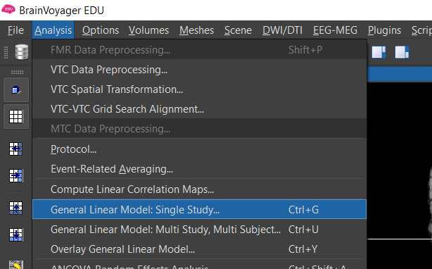
Figure 2-2. Menu to compute maps using the General Linear Model
2) Select Analysis/General Linear Model : Single Study... Now let's generate a box car function with the expected neural response (high for the four main conditions, low for the baseline). Recall that fMRI is an indirect mesure of neural activity. The expected neural activation is often modeled using a box car function . We then use a mathematical procedure called convolution to model the expected BOLD response based on the known relationship between neuronal activity and BOLD -- the hemodynamic response function (HRF) .
If you are using a PC, left-click on any black period and right-click on the blue, pink or purple/green and gray periods. If you are using a Mac, click on any black period and control-click on some part of each of the four colored periods.
Once you have the expected box car function, click on the HRF button to convolve the predictor with the default HRF function.
Optional: If you want to see the effect of using a different HRF, you can clear the predictor, regenerate the box car predictor, go into options, select the HRF tab, select Boynton, click OK, and then click HRF. After this, however, repeat these steps using the default two-gamma function.
Click GO .
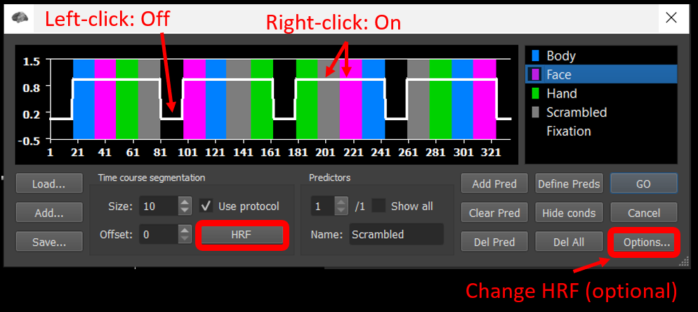
Figure 2-3. Explanation of how to manually create a box car predictor and convolve it.
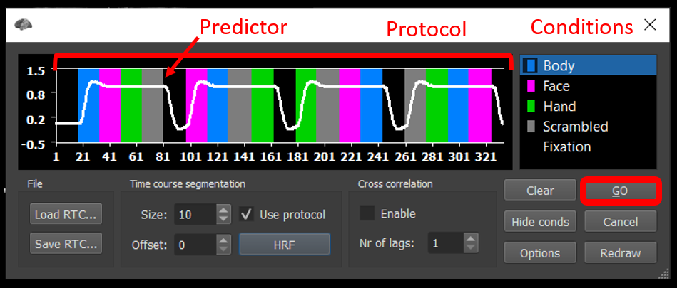
Figure 2-4. Shows how the convolved predictor should appear.
Running a voxelwise t-test computes one statistical parameter for every resampled functional voxel (here 194,000 t values). Since we did a t-test, the parameter is t, but as we will see later, other parameters can be estimated (e.g., r for a correlation, F for an analysis of variance, ANOVA).
Parameters can be visualized by generating a statistical "heat map" in which each voxel is assigned a color based on the value of the statistical parameter. (This is also known as a statistical parametric map, and why a classic fMRI analysis software package is called SPM). The heat map is generated by assigning a color to each voxel (or leaving it transparent) based upon the level of the parameter. This correspondence is determined by a look-up table (LUT).
Maps are typically overlaid on the anatomical scan to make it easier to see the anatomical location of activation (but remember the map was generated from the functional scans).
If you hover your mouse over different voxels, you will see the t-value(t) and p value for any given voxel.
Question 8:
a) Look at the color scale on the right of the coronal view. What do the numbers on the scale represent? What do the warm and cool colors represent?
b) Where would you expect significant activation for this model? Where would you NOT expect to see legitimate activation for this model?
Toggle between two different look-up tables that BrainVoyager provides. Select File/Settings... (or BrainVoyager/Preferences... for Mac users), and in the GUI tab, try out two default options: "New Map Default Colors (v21+)" an "Classic Map Colors (pre-v21)" and click Apply after each selection.
Note: The course slides and tutorials use the Classic colors.
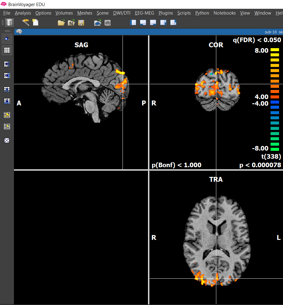
Figure 2-5. Activation depicted with BrainVoyager’s Classic LUT
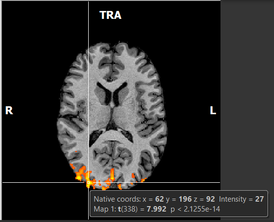
Figure 2-6. Hovering the mouse over a voxel will show its coordinates, intensity, statistical parameter value and p value.
The mapping between parameter values and the colors in the look-up table (on the right side of the coronal view) can be adjusted. The most important setting is the minimum value or the threshold . Any t-value closer to zero than the minimum do not get mapped to a color (i.e., the voxels are rendered as transparent). For example, if the threshold is t = 3.00, they only voxels with t > 3.00 or t < -3.00 will be colored.
There are a few ways to modify the threshold.
3) First, you can adjust the threshold by using the icons (circled in red) in the left side bar. Try it.
Question 9: How do the numbers on the look up table change when decreasing and increasing the threshold? (Hint: Look at the p-value in the bottom right corner.)

Figure 2-7. The minimum p value (threshold) can be quickly adjusted using these buttons to increase the threshold (bigger blob button) or decrease the threshold (smaller blob button).
4) Select Analysis/Overlay Volume maps... . This will open the Volume Maps window. Next, click on the Statistics tab and set the Thresholding section to Set threshold manually . Here, we can set the maximum and minimum t-value threshold manually in the Confidence range section. Try changing the min and max values and observe the result on the statistical maps.
Question 10: Set the threshold to zero and explain what you see. Why are there colored voxels outside the brain?
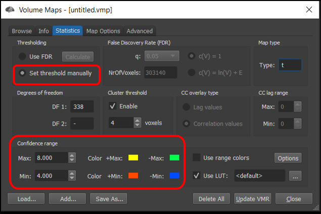
Figure 2-8. Many features of the statistical map, including the minimum (threshold) and maximum can be controlled precisely using the Volume Maps control panel.

Figure 2-9. A specific p value can be specified in Map Options tab of the Volume Maps panel.
5) Now, click on the Map Options tab. Here, we can set a threshold using p values instead of t-values.
Question 11: Set the threshold to p < .05 and click Apply. Given that a p-value threshold of .05 is the usual statistical standard, why is it suboptimal for voxelwise fMRI analyses?
In the next tutorial, we will consider strategies to deal with this problem.